Behind the paywall: The Times they are a-boring
So I've paid my pound for a month's subscription to the Times website, more out of curiosity really then being a loyal reader. I very rarely read a printed copy but do generally like their web content and was keen to see how they were going to make it sparkle now people are paying directly to see it.
They've been running a free version of the new-look site for a few weeks now to give you an idea of what it'll be like. But I thought they would have livened things up a bit on launch day. Because they've got to offer something really special and exclusive to make you feel happy about the financial transaction required to view the stuff. And to wipe away the slightly grubby feeling you get from handing your pound directly to Mr Murdoch rather than being vaguely aware that it's all paid for by advertising.
My general feeling is come on guys, make an effort!
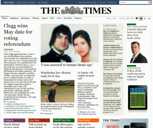
It's so dowdy. You need headlines that really sing, some sort of consistency in their layout (are they one line, two lines, three?) and to pay attention to how the text sits on the page. For example that lead zzzzzzzzztory about Nick Clegg is this long-winded paragraph in a fuddy-duddy font, bunched up against links, author name and date which just makes reading hard work. Each piece feels like it was cut and pasted in without anyone opting to preview before publishing. Even the items on the nav look blurry rather than crisp, a constant reminder of how the whole thing needs sharpening up.
They could take a tip from the Daily Mail, who work their pictures and captions hard - and enjoy soaring page impressions as a result. Or be more creative with colour like on the Guardian site.
And where's the article on the homepage referring to the first day of the paywall, explaining the new approach, welcoming people and encouraging loyalty?
The thing is I do want it to work - as a content producer the whole concept of paying for good quality content makes me cheer inside. But key to its success is producing content that excites. To pinch a phrase from TV talent show judges - they really need to up their game.