Design + data: How infographics help you understand and remember information

Our designer Adriana explains why infographics are so effective at communicating data.
Information design and visualisation as a way for communicating data have been successfully applied in science and publishing for centuries, with the aim of providing clear and efficient ways to process and deliver information for analysis purposes.
However, with the rise of online communication, information design has transcended its original meaning and is reimagined to serve different purposes such as entertainment and commercial marketing.
Currently, the term is associated more with the long and skinny graphics that flood the online space and are referred to as infographics, than with the charts and diagrams that fill up science and history books - like this visual of Napoleon's 1812 march.

Nowadays, great design has become one of the main instruments to make your brand distinguishable and one of the key prerequisites for successful consumer acquisition and retention.
This is also applicable to infographics as they represent an already very popular medium for online communication.
Generally, one can differentiate between two approaches of infographic design - explorative and narrative.
Explorative infographics employ minimalistic design and include only elements that represent data with the aim of providing information in a clear and concise fashion. Their usual field of application is academic/scientific research, intelligence reports and data analysis.
Narrative-based infographics favour an illustrative design approach that is focused on engaging the viewer with appealing visuals that often produce the feeling that you are being entertained while being informed.
They are extremely suitable for commercial use and are often used for content marketing or as sales and marketing materials. We love this example, The 39 stats: Charting Hitchcock's Obsessions.
In a commercial context a successful visualisation of information should draw the viewers’ attention aesthetically while providing knowledge that is easily comprehensible and memorable.
The key success factors of infographics are appeal, comprehension and retention.
Create infographics that appeal to your audience
Appealing to your audience in the information hubbub of today is anything but easy. There is no universal formula for success, but there are a few considerations that need to be addressed. As much as infographics are essentially visuals, design should come second to the actual message you want to communicate.
Choosing the right topic
The first step to creating appealing content is having the right topic. But how best to do this?
Firstly, you should have a general idea of who your audience is, what they can relate to and what interests them.
However, knowing your audience is tricky and jumping to assumptions can often bring more harm than good. If you don’t have specific data on your audience then try to establish a goal for the infographic – do you want to raise brand awareness, generate traffic, promote a product or service?
If that is the case do your best to find a topic that will reflect the message of your brand or importance of your product/service.
For example, if you are representing a business that delivers quality products and recipes you might want to work with topics such as the benefits of healthy eating. Try to keep a positive tone – pick the benefits of healthy eating rather than health hazards caused by consumption of fast food.
It is also useful to gather as much relevant and structured data as possible. Keep in mind that a graphic representation could not be a substitute for a well-informed in-depth research. In other words – have interesting, relevant, up-to-date information before jumping to the design.

The grand design
To a large extent the design of an infographic is predetermined by the information itself. Some people like to divide infographics in types such as case study infographics, timeline infographics, comparison infographics etc.
However, the case might often be that the nature of your research requires a little bit of everything to be included in the final graphic. That is why it is worth analyzing the content before starting the design and evaluating which approaches would contribute to the overall goal of the infographic.
There are two main schools of thought in information design. According to one of them design should solely serve the information and strive to convey it in the most economic and clear way.
Contrarily to this rather purist view is the notion that design is equally as important and the use of iconography, decorative framing and illustrations adds value to the overall outcome.
It is clear that the second view is more popular with designers of infographics for entertainment and marketing but in truth, good information design stands somewhere in the middle.
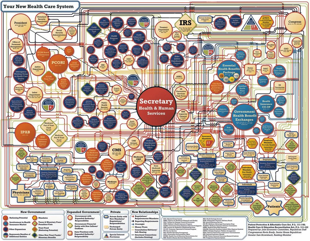
Too few graphics and you lose visual interest and audience engagement. Too much chart junk and you jeopardize the whole process of communication. In this graphic, about Obamacare, they have squeezed a lot in! The best and admittedly most vague advice in this case is to try and maintain a healthy balance.
Infographics help comprehension and retention of information
Ensuring comprehension among your audience is crucial for successful communication.
It is important to carefully consider the properties of the channels you are using and the respective media that carry your message.
Nowadays, the internet is one of the primary channels for knowledge transfer, learning and obtaining information and the applications it provides are relying primarily on visual display.
Thus the combination of textual information with visual elements in the form of an infographic stands out as an exceptionally suitable medium for getting your message across in a comprehensible manner that offers a high level of retention.
As many studies have revealed, we are able to attain greater amounts of information through visual perception in comparison to the combined throughput of all our other senses.
This is due to the fact that pre-attentive attributes of visualisations like colour, form and spatial position can be perceived almost instantly by our eyes and processed by our brain with remarkable accuracy and without the need for active attention.
For example a simple change in colour can be used as a means of communicating emphasis, hierarchy or particular structure.
Such pre-attentive attributes are inherent to all kinds of visualisations and using them in accordance to the specific context is key success factor for communicating information.
Consider this in the process and try to apply the basic principles design to the best interest of the information and with thought to the audience as well as the setting they will be viewing your content in.
Moreover, the immediacy and the involuntary or unconscious character of the experience these attributes presuppose makes infographics very suitable for communicating in a time-efficient and comprehensible fashion.
The visual elements contribute not only to the aesthetic value of the infographic but can also be used to reduce the time needed for processing and understanding the message.
However, this does not mean that you should use only colours, shapes or symbols to convey a message.
Strong visual communication achieves clarity and personality by incorporating both the use of instantly perceivable elements and the use of words/text for description or in constructing the overall narrative of the infographic. Don’t forget that the brand identity could also be incorporated in the design, thus raising the brand awareness.
Visualising data help us memorise the information
Another advantage of using visualisations lies in how visual elements contribute to memorising information.
Studies in the area have shown that an illustrative design approach can contribute to the viewers’ ability to memorise and recall the provided information.
The use of imagery in infographics can aid not only to comprehension and aesthetic appeal, but is also involved in forming visual memories, thus reinforcing the process of memory recall as well.
Additionally, the use of visual elements that adhere to the stylistic personality of the infographic can further this effect.
However, don’t treat this as a rule of thumb! It is true that visuals are in no way a guarantee that your infographic will provoke and engage your audience but developing a thoughtful topic and design might just get you on the surface of the information wave.
Need help with design?
At Sookio we offer a range of content marketing services, including design for infographics, blogging and video. Get in touch and tell us more about your project.


