Can graphic design (and copywriting) save your life?
Reflections on communications in healthcare, as Sue visits the Wellcome Collection’s new exhibition and thinks back to personal experiences on the cancer ward. How crucial is good design and careful copy in showing empathy, explaining complex concepts, and simply making people feel better?
So I remember it clearly, sitting on Ward Nine in Addenbrooke’s Hospital with my Mum, the day after she had been admitted as scans showed that the breast cancer had spread to her brain.
The doctor – who we had never met before, and who refused to sit down so she would be at the same level as us – didn’t look impressed that I was making notes on my laptop, something which I had done at every oncology appointment since March that year when Mum was first diagnosed.
She was talking about radiotherapy, and using a lot of phrases we didn’t understand. It was when she said something about '20 grey in five fractions' that I asked her to repeat the phrase. It was a string of words I’ve never heard together before and I wanted to get it right so I could look it up later.
She gave me a withering look, like I was a 6th form student who’d asked a stupid question about the homework, and said it again. She then reeled off a load of other stuff at 100mph, and then off she went to inflict her warm bedside manner on someone else.

Image credit: Macmillan Cancer Support
Under the pretence of going to get a cup of tea – but obviously because I didn’t want Mum to see me looking so upset – I went out to take some deep breaths, and casually picked up some leaflets from Macmillan Cancer Support from the rack in the corridor.
The words I read made me mouth ‘thank you’ to the copywriter who wrote them. I thought I already understood about the importance of writing for your audience. But it wasn’t until I stood there in that hospital corridor holding the leaflets that I really understood. So how were they written?
In plain English, using everyday words the reader could understand, even when they're feeling emotional or, let's be honest, frightened
With short sentences, to help avoid any confusion
They spoke directly to the reader and said ‘you’
With lots of white space and bullet points rather than dense paragraphs of text, to help you understand the content at a glance when your brain is racing as you try to make sense of the situation.
It was copy that was clear, and kind. And which, for a brief moment, made me feel a little better.
The relationship between graphic design and health
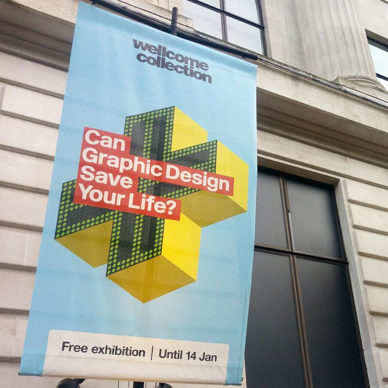
I thought back to this experience when visiting the Wellcome Collection’s fascinating new exhibition Can Graphic Design Save Your Life?
Seeing the Macmillan leaflets on display, I thought, ‘Good, glad someone else has picked up on this too’. But this time round the focus was on the design rather than the copy.
I hadn’t really thought about the green hand-drawn font before, and how that helps the charity come across as more friendly and on the same level as the patient/carer – as opposed to a more formal, top-down feel that you might get with a standard Times New Roman or Arial font.
“The rebrand increased fundraising by £26 million within two years. Using a hand-drawn font that feels warm and approachable but speaks with sincerity and authority, Wolff Olins created an adaptable visual identity that feels personal rather than institutional, and is as effective on the high street as it is online.”
Good graphic design will help patients
The exhibition also shows how the NHS font was developed. A reworking of the Rail Alphabet, it was designed in 1965 by Margaret Calvert, co-designer of the UK’s road signage system.
That the font is so easy to read is an important element in helping alleviate confusion and the fear that sometimes abounds when people visit a hospital. It’s also a crucial element in helping people find where they’re going in a typically large and unfamiliar maze of hospital corridors:
“Highly visible and consistent wayfinding systems not only assist journeys from A to B, but also capture the hospital’s ethos of being helpful, which in turn inspires confidence.”
Designing hospitals for children
I loved seeing how graphic design is used around the world to make hospitals feel less intimidating to children. Colourful murals, friendly signage and playful tigers which encourage games of hide and seek – how lovely that so much thought is put into designing these paediatric centres.
This wording summed it up for me:
“Graphic design in hospitals does more than instruct and inform – it can help people feel better.”
Graphic design and cigarettes - to promote or repulse?
And what doesn’t make you feel better? Smoking! I was particularly taken by the idea that graphic design was at first used to sell more cigarettes; then to highlight the dangers.

Image credit: Wellcome Collection
Lucky Strike, for example, was first known for its distinctive green packaging. But then...
“Raymond Loewy, designer of the Shell, TWA and SPAR logos, accepted a $50,000 wager that he could not improve on this design. He changed the packet to white and placed the red medallion logo on the front and back, moving the text to the side panel. This increased brand visibility – and sales.”
With Silk Cut, Charles Saatchi broke new ground in advertising. The brand name itself was never mentioned – you just saw the luxurious purple silk and knew instantly what they were promoting.
Death Cigarettes in the 1990s went in the opposite direction and used abrupt, attention-grabbing copy to highlight the dangers – well, you can tell that from the name alone.
With the move towards making cigarette packaging as unappealing as possible, market researchers GfK Blue Moon tested different background colours to discover the least appealing colour. Congratulations Pantone 448C, it’s you. And for the unpleasant font? Lucida Sans, in Cool Gray 2.
Early use of infographics in medicine
Fans of information design will be interested to see pioneer Fritz Kahn’s 1926 poster Das Leben des Menschen which shows how the body works.
Image credit: Smithsonian Mag
But it’s often overlooked what part Florence Nightingale also played, with her diagrams showing mortality statistics of the British army in the Crimea, which led to improvements in hospital conditions and a dramatic decrease in deaths.
And if you have any thoughts on communications in healthcare, do comment below.
How can Sookio help you? Contact us now to find out.