Highlights from #WIADayLDN16: "We're all on the same team"
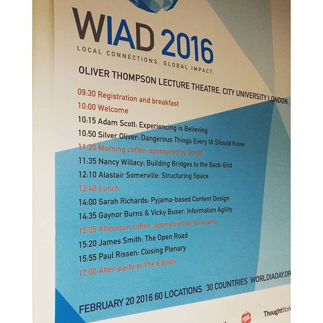
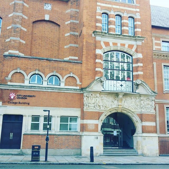
We went to London's City University on 20 February 2016 to be part of World Information Architecture Day, where the common thread in a thought-provoking series of talks was the power of collaboration.
I've been knocking around the web content game for some time now. Back when the BBC called the department New Media, I was working for an independent radio company and looking after the content for a music website for Radio 2, learning html as I went and discovering what makes people read and respond to your content.
After that I became Project Manager at ITV.com, back in the days when the people who managed the web presence for Pop Idol looked at you funny if you suggested that they should work on a Saturday night and update the page while the show was actually going out.
Fast forward thirteen years and things have moved on somewhat. There's real consideration about what makes up our digital content, about how we can deliver a service that suits our users – whatever time of day or night they're looking at our website, whatever information they're looking for and from whatever device they're using.
Which is why a whole day devoted to information architecture held real appeal for me. We've gone through the Wild West years of carving out this whole new digital landscape, and now it's all about doing it properly. Not seeing a website as a dumping ground for everything we've ever known about our organisation, but looking at what our audience actually wants to know and giving it to them clearly, efficiently, easily.
The thread that ran through today's event was collaboration. For a project to really succeed, information architects need to play nicely with developers, editors and the people who hold the purse strings. Here are some of my highlights from the day:
Adam Scott (@adamfreestate) had a five-point approach to content. Using the example of Disneyland – and thinking way back to when it was first built and was a miraculous unknown - there needs to be...
a point of collision (your first encounter)
curiosity (why is there a toy train station by the freeway? WTF is that Bavarian castle doing there?)
connection (walking down Main Street feels familiar, yet is somehow...different...)
collaboration (visitors come round to the idea and get into the swing of it)
celebration (we're so happy to be here and we're going to tell all our friends! Hurray!)
As Adam explained, it has a lobster pot effect, where it draws you in and you can't escape. Much like the Frank Gehry-designed MIT building, which is a totally different experience but with the same result. Architecture affecting our thinking.
There was an infectious feeling of optimism running through everything Adam spoke about: "Fusing the physical and digital, we can make cities that aren't just smart, they're delightful."
Silver Oliver (@silveroliver) made some interesting points about categorisation, including the confusion over which recycling bin to go for when disposing of our coffee cups. I hadn't thought about this before but he's right - it's never as easy as it should be.
It's more about thinking how people react to categories and giving them examples to help shape their behaviour. It's not just where they should throw their coffee cup but where they shouldn't.
Placing related categories around the content can help with this. You're not sure what it is, but you know what it's not. And this helps you reach a decision about what to go for, whether it's binning your recycling or picking which show to watch on Netflix or BBC iPlayer.
Nancy Willacy (@nancetron) from the Wellcome Trust had a lot to say about the importance of communication between the people managing the content and those working on the back end.
Defining herself as an 'uncomfortable generalist', she was saying there's some confusion over the role, whereas a developer role is more clear cut.
The key to success is communications. We're all on the same side here!
Alistair Somerville (@acuity_design) spoke about sensory design, or, as he said most people understand it, accessibility.
Talking through how he has designed content for the visually impaired (who can't skim through the content, and for whom friction on the page is really important if they are using their fingers, not just their eyes) and about the gallery map he helped design for the Imperial War Museum, he was able to explain the importance of nothing, of empty spaces.
This is something we think about a lot too. Walk away from the computer when you're trying to think of a tagline or struggling to get that sentence just right, and it will come to you when you're at the kettle making a cup of tea.
Break up your content with subheadings and bullet points to create more space, add more 'nothing' around the words and people will understand the information more easily. Give yourself and your readers some room to breathe.
As he explained:
Complexity isn't the problem; ambiguity is the problem.
Don't worry about complexity v simplicity, Worry about clarity.
Designers do not hold meaning, users do.
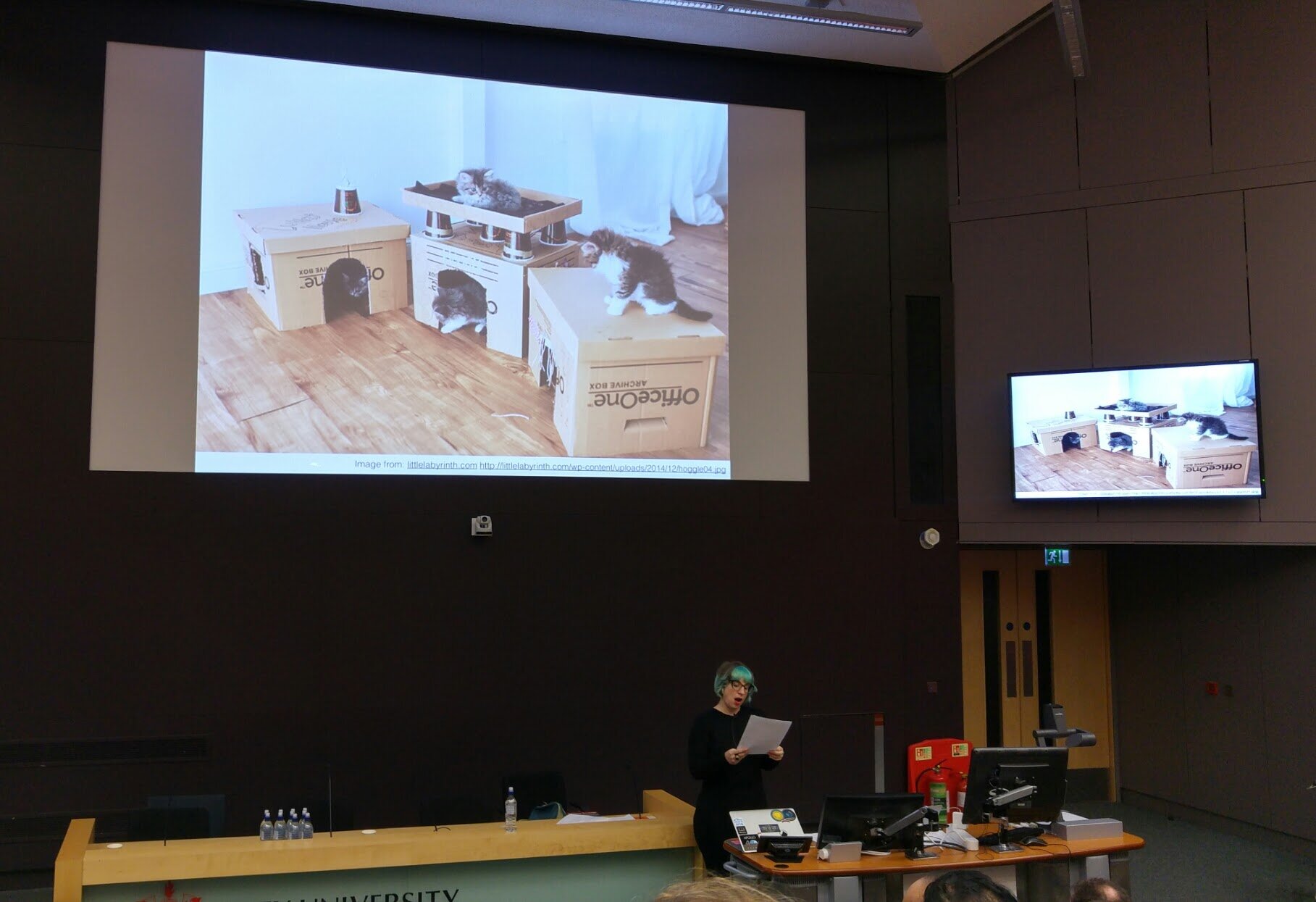
Having worked with Government Digital Services in 2014/15 as part of a small team training people in writing for the web and the new GOV.UK platform, I was particularly interested to hear what Sarah Richards (@escmum), formerly head of content design for Government Digital Services, and Gaynor Burns (@gaynorburns) and Vicky Buser (@vickybuser) of GDS had to say.
The emphasis in the GOV.UK design principles is always to start with user needs. And not in a vague kinda way where you spend two minutes pretending to know how people speak and behave, but conducting actual testing with real-life users.
And if you can't do that, says Sarah, try rooting around in forums to see how what people are really up to. They give you invaluable information, which, while it shouldn't replace talking to people face to face, you'll get an insight into behaviour and the words they use.
The GOV.UK site now has 190k content items, from over 300 organisations. There are 10m visitors a week. You can't just concentrate on the most popular search terms because there will always be someone that needs an answer to a very niche question. Sometimes the user doesn't even know what question to ask because they don't know a service exists to help them.
Bringing together good taxonomy + tagging + display means the GDS team are developing a site which is:
- simple enough to scale
- flexible enough to adapt
- consistent, but not uniform.
Which is why governments around the world are talking to GDS about how to replicate the model to untangle their own public sector websites.
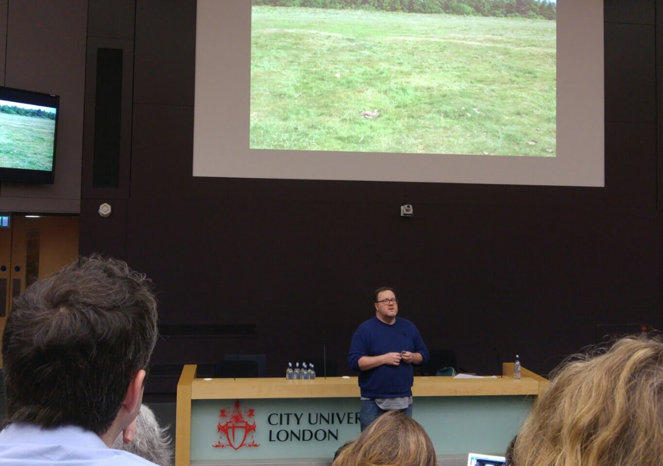
James Smith (@floppy) from the Open Data Institute was passionate about making data available to everyone, for example DEFRA putting line three decades of food diaries.
BBC data architect Paul Rissen (@r4isstatic) closed by explaining, "I'm a web designer, I design webs." We don't rely on linear narratives anymore, we expect everything to be interconnected. Which was a lovely metaphor for us working in the industry. We're not just creating webs of content, we're working with our peers across the industry to create the best experience for the user.
Summary: The theme that came out throughout the day was collaboration.
For an information architect to do their job properly they need to work closely with the developers and clearly define their role so that everyone understands their value.
The people developing the product need to communicate with real-life users.
Those who are analysing the data need to talk to the client but also to the developers and content creators so we can work together to produce better outcomes. As Nancy said, we're all on the same team...!
Big thanks to the #WIADay2016 team (not least for the veggie-by-default food options!) and see you next year....

