Your website can't live without these usability and accessibility tips

Usability is sexy. Accessibility is hot. Clarity is…phwoar! What could be more gorgeous than a website that is easy to use and accessible for all?
We’re full of tips for businesses who know that better usability helps win the hearts of customers, but don’t know where to start. As luck would have it, we’re going to share some of them right here.
Today, we’ll be showing you:
So, what’s the difference between usability and accessibility?
Usability is making sure someone can visit your website and do the thing they need to do. This could be to book tickets to your event. Apply for a job. Find out when the bins are going to be collected.
You want to make sure they can achieve this goal as easily and efficiently as possible, from the very first time they visit your site.
Accessibility – when we’re talking about website design – is all about making sure that all users have equal access to the content, with no barriers.
And how long has this been a problem?
I’ve been working digital content since digital content became a thing. And I can’t tell you the number of conversations I’ve had where people are dismissive about usability.
I remember back in 2003 when I was at ITV.com, and I was telling the sales team about all the complaints we were getting from viewers about the pop-ups. People were clicking on some ghastly car advert when all they wanted to do was find out what time Coronation Street was on.
The response? A shrug of the shoulders and a grumble about users being stupid – surely they can see these were ads! All they had to do was spot the teeny tiny ickle cross to close them down!
And what’s so wrong with that?
If people are coming to your website and find themselves unable to do the simple things they’re trying to do, it’s your fault, not theirs. We shouldn’t blame the user.
Unfortunately, the indifference to accessibility I saw in 2003 hasn’t gone away.
I regularly have conversations with people who don’t care that layering pale text over a cluttered image will make it hard to read. Or they expect people to actively enjoy filling in an online form that is 20 pages long rather than two.
We don’t spend enough time putting ourselves in the shoes of those actually using our websites, or actively trying to remove obstacles for those trying to get at our content.
But surely this doesn’t effect many people? Why do we need to bother?
Here are some facts and figures from the Disabled Living Foundation:
Around 1 in 5 of the UK population is disabled; that’s 13.3 million people
One person in 30 has sight problems (and this figure is going up)
One in six people has a form of hearing loss; around 10 million people
And over in the US, 48% of adults have trouble reading, explained Dana Chisnell in her Camp Digital talk Democracy is a Design Problem.
That’s 32 million people who can’t read, which is quite some figure, isn’t it?
What does this mean for businesses?
Well, I have good news for you. Making your websites more usable and accessible will….
Save you time. If people can find information easily and understand what you’re saying, you won’t get repeated phone calls asking for clarification of exactly the same information the last caller asked about.
Or, as Jared Spool explained in his talk Beyond the UX Tipping Point, if website content was created with the user in mind, people wouldn’t rock up at Disneyland thinking they’d booked for Disney World…5000 miles away. Oops.
Save you money. Make you money! You’re making it easier for people to buy from you. Book tickets. Sign up to a trial of your product. Join your mailing list and allow you to trouble their inbox, day after day.
Make you more attractive. Oh yes it will. You’ll earn positive sentiment from customers who are more able to find information and use your service.
Talented people will feel included, and more likely to apply to work with you. So if your diversity policy looks great on paper but hasn’t materialised into actual people on payroll, have you thought about making web content more inclusive? I have tips.
How do users feel about accessible content?
For the humble user, an accessible website suggests that…
Organisations respect you. This is particularly important in the public sector, where we’re all taxpayers paying for this service.
They respect your time, and they actively avoid trying to cause you pain or discomfort while using their service.
They are more trustworthy. Information is easy to find, not hidden away.
Pricing is a good example here. If this is tucked away, buried out of sight, then it suggests that you’re not transparent as a company.
See also 56-page long terms and conditions. Why not cut this down, pop in some clear subheadings, make it easier for everyone to understand?
So how do we design for accessibility when we don’t have the budget?
This is the case for so many organisations. Not everyone has a crack team of developers schooled in the latest trends in accessible design. Or any time or money to throw at it.
Both Curt Holst from Barclays and Sarah Richards – formerly from Government Digital Services and who now runs the excellent Content Design London – explain how you can start getting into the accessibility mindset.
It’s best summed up by this line from Microsoft’s Inclusive Design Toolkit: Solve for one, extend to many.
So if you make your accessible for people with permanent disabilities, you help those with temporary and situational issues too.
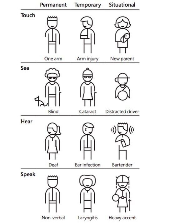
Excellent! …What does that mean?
Think about the person with permanent hearing loss. If you add captions to your videos and transcripts below, it also helps someone with temporary hearing loss due to an ear infection. Or the person watching your video on the train.
I’m British and I hate the idea that I might disturb the passenger next to me. I mean God, how embarrassing.
Or let’s say someone has had their arm amputated after a traffic accident and is always operating devices one-handed.
If you simplify the navigation, reduce page length so there’s less scrolling, and take information out of downloadable PDFs and into a web page, it also helps someone who has their arm in a sling.
Or the mother holding a baby, looking something up on her smartphone, and doing 101 other things at the same time.
What’s an easy way to do usability research (without doing usability research?)
The first thing I would do is ask the receptionist.
Whoever is fielding calls for your business all day will be a mine of information. There’s also the Contact page on your website. What are the queries that people ask again and again? How can you make this information more visible on your website?
So we don’t have to actually talk to users? Ugh! I mean, the very thought
Woah there, pickle. Yes you do. I like what Jared Spool said in his talk, that watching how users use your product always dramatically improves how the thing is designed and works.
But you don’t have to get together a big research group featuring a random sample of typical users.
Next time you’re round at a relative’s house, get them to look at your website. Make sure it’s on their own computer or phone. Give them a simple task to find a particular page or piece of information.
This is interesting, isn’t it? You suddenly see how they don’t spot that call to action after all, that they miss key information from the form, that they can’t navigate in the way you intended.
This feedback is like gold, and will help you make changes (pronto).
Ask yourself:
Are we giving clear answers to common questions?
How does it work on mobile?
What do they do ‘wrong’?
But how do I get others to care about accessibility?
I think it’s important to get everyone else fired up about accessible content too, and you should embed it into every step of the content creation process.
We talk to clients about the benefits of making their content accessible to as many potential customers as possible, and build this into the brief.
Designers and developers should be encouraged to follow the latest conventions in inclusive design and build them in by default.
Ask customers when you get the opportunity, for example a quick link at the bottom of the page.
Tell me some quick wins for the content team
Let the text breathe! Being able to see the shapes around the words is really helpful to people with dyslexia. Short sentences. Line breaks. Large fonts.
Break things up with clear subheadings. Transform a dense, waffly paragraph by turning it into a simple list of bullet points.
Always add descriptions and alt tags to your images (in social media posts too).
Add captions and transcriptions to video.
Use specifics to help people with lower levels of literacy or autism - rather than jargon, idioms and abstract phrases.
Download, print and frame these posters from the Accessibility team at Government Digital Services (above), and put them up round the office - like we have!
Where can I start learning about accessibility?
This was a big topic of last year’s Camp Digital event. Catch up with our tweets from the day in our mega-thread below:
Usability tools to try (when you don't know your UX from your alt tag)
Not every business has a team of developers on call to ensure their website meets the latest accessibility standards. What free or low-cost usability tools are out there to help ensure your website content is accessible to all?
1. Try a screen reader
NVDA is free software which reads out the text in your website. How does your own site sound?
The founders believe that every blind and visually impaired person deserves the right to freely and easily access a computer. The tool they’ve developed is used by visually impaired people in 200 countries and has been translated into 43 different languages.
There are lots of others available, and with this one being free it’s a great place to start.
2. Install the NoCoffee extension
This is a simply brilliant Chrome extension which shows how your website could look to people with different conditions or levels of vision impairment. Hat tip to Sarah Richards for highlighting this in her Camp Digital talk.
This is how the BBC Weather page could look to someone with macular degeneration, for example.

How to use NoCoffee:
1. Install the extension
2. Play with the settings to simulate things like visual blur, cloudiness or glaucoma symptoms
3. Open up a website on a new tab. See the result…
Suddenly you realise that your beautiful palette actually causes problems for people with colour blindness. You understand how that paragraph of incredibly dense text is impenetrable to someone with cataracts.
From there, you can make design decisions to help ensure your website is more usable by your audience.
3. Open up the Microsoft Inclusive Toolkit
Great to see Microsoft leading the way here, and making these tools available. Obviously they’re targeted at developers but there’s plenty here for the layperson to get to grips with.
Download the Microsoft Inclusive Design toolkit and try out the Inclusive 101 manual or inclusive activities to get you into the accessibility mindset.
Meanwhile, there's all sorts of accessibility goodness in everyday Microsoft products. You might have spent a lot of time on Teams in 2020, but did you know it has:
Live captions (with the usual caveats around accents and background noise)
A 'blur background' option to help lip readers focus on what you're saying
Live translation, with an ever-expanding list of supported languages
Dark mode to take the strain off the eyes
Integration with Immersive Reader
Even the usual bread-and-butter Microsoft apps can give you help with accessibility. The Office 365 version of PowerPoint offers transcription and translation for presenters. Microsoft Word has loads of features which you can explore on their support page.
4. Put up these accessibility posters
OK, so these are not tools. But it’s a brilliant way of creating a culture of accessibility in your organisation.
I came across them while doing training in writing for the web at a Government department. They were displayed prominently, which I thought was such a good idea that when I got back to Sookio HQ I printed them off, framed them and did exactly the same.

Created by Home Office Digital, they offer clear tips on designing for users who are deaf, visually impaired, have motor disabilities and other issues. This page also offers a ton of tips on the dos and don’ts of designing for accessibility
Download the accessibility posters, print, display, off you go!
5. Have a play with Hotjar
This tool shows you all sorts of interesting things.
Like heatmaps to show you which areas of your website really capture visitor attention. You can even record their journeys around the site, and see where they drop off. Online forms! Why aren’t people filling them in?
Hotjar is aimed at commercial businesses and priced accordingly, but there’s also a free version to get you started.

6. Try a five-second test
When people visit your website, you have mere seconds to grab their attention. And do they really understand who you are and what you offer?
This tool offers a very effective way of seeing if your website potentially has high usability - meaning people will be able to do the thing they want to do - or if it will slow people down. To use the five-second test, simply:
Upload a screengrab plus a simple question about the design
Groups of testers have five seconds to look at the page, then answer your question. You then get to see the responses. Great!
7. Get advice from the Hemingway Editor
The Hemingway app helps you write with clarity. It highlights lengthy sentences, suggests more everyday language, and stops you being so passive.
The outcome? Language that your audience understands. Text that is easier to read if you’re visually impaired or have lower levels of literacy.
And if people understand what you’re saying, they’re more likely to stay on your site, return another day and, you never know…they might actually buy something!
8. Pick the best captioning app for your video
Creating closed captions (where the viewer can choose to enable or disable captions, fun bonus fact) takes all that hard work you put into your video and, quite simply, amplifies it to more people. More audience. More ROI.
It doesn't even have to take forever, there are apps to do it for you:
MixCaptions will caption pre-recorded videos of up to 10 minutes. The free version gives you a limited number of characters before you have to fork out more more
Amara is built for desktop, unlike MixCaptions which is optimised for mobile. You simply enter a video URL and Amara will handle the rest, with simple intuitive controls
Clipomatic works on live video on your phone, perfect for transcribing off-the-cuff social media content. Its design features are more limited than the other two, however
Shout out to Molly Watt of Sigma for these picks. You can explore more of her accessibility philosophy in her blog post on producing more inclusive content.
Digital content with heart by Sookio
Here at Sookio, we practice what we preach when it comes to crafting great content that resonates with all your audience.
Want to hear what we can do to make your content accessible to more people than ever? Contact us and let’s get cracking.